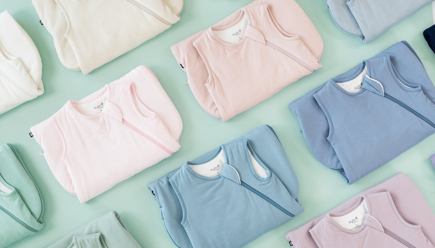


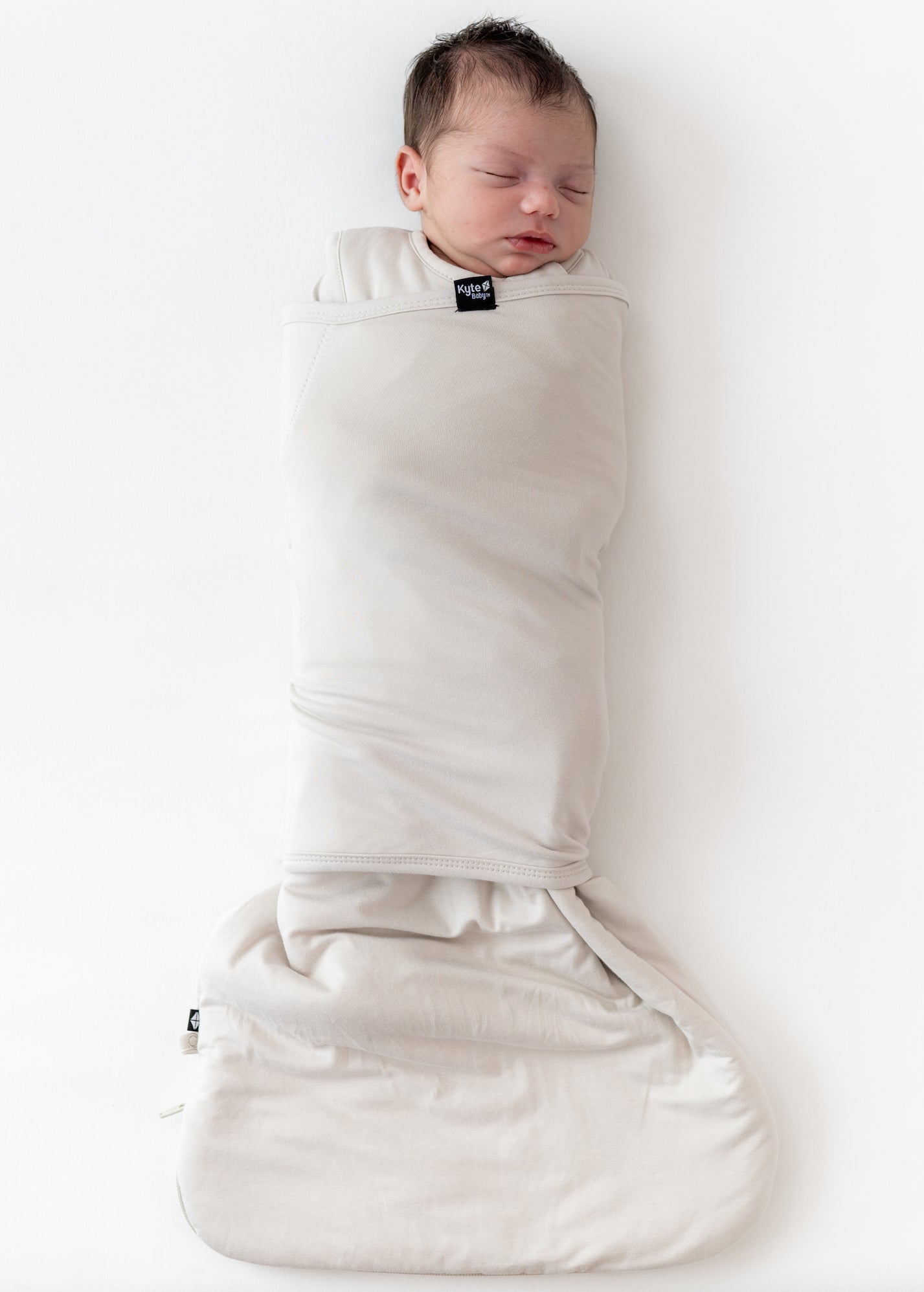


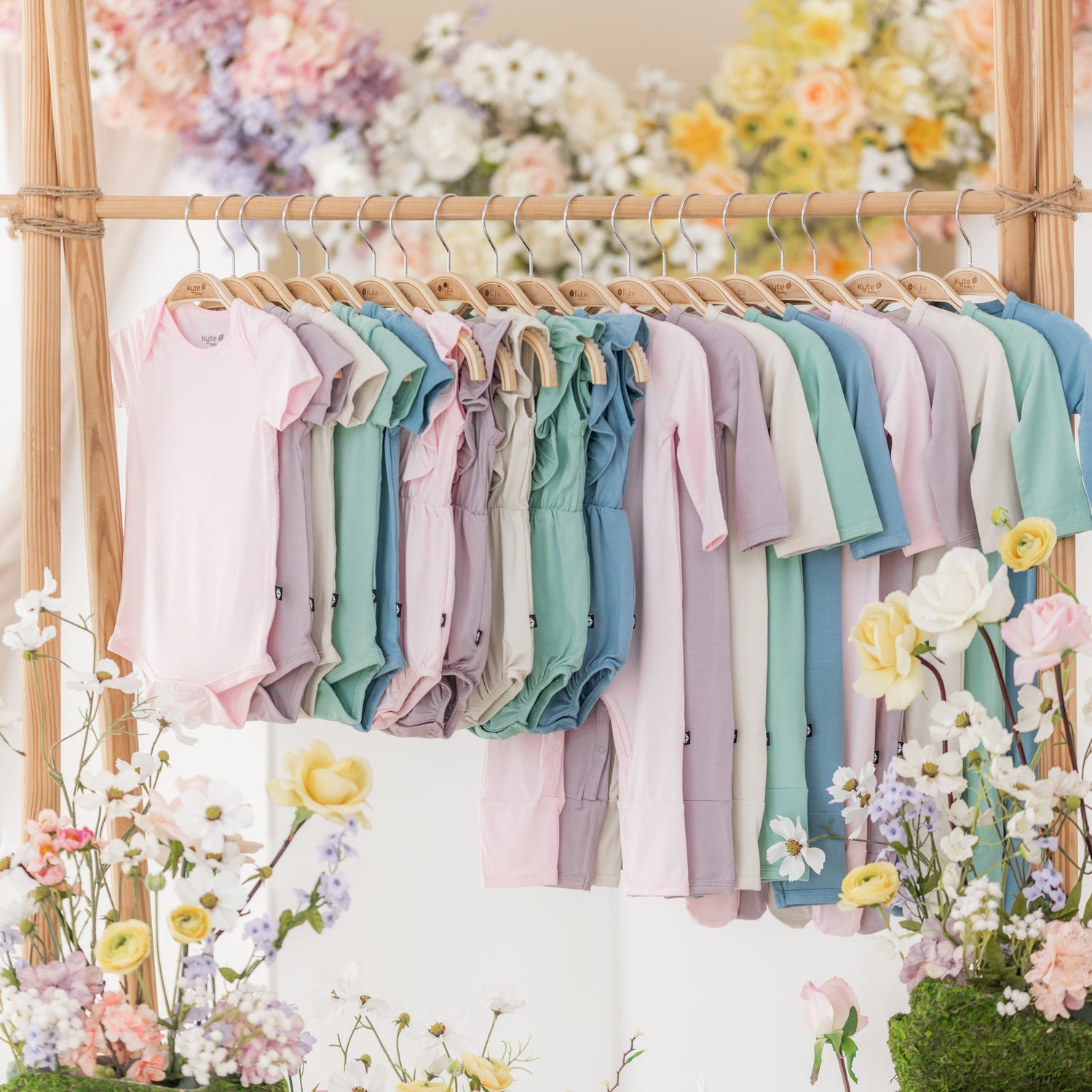
Springtime is just around the corner, bringing warmer weather, fragrant blooms, and longer days. After a cold and dreary winter, the fresh air and sunshine feel like a warm welcome from Mother Earth herself. Spring is the season of all things new, and in the spirit of renewal, we have a brand-new collection of solids to refresh your family’s wardrobe. Introducing our 2024 spring solids, a palette of calming colors inspired by springtime in Japan. Find tranquility in Sakura, Wasabi, Dusty Blue, Wisteria, and Ecru, five colors that feel like the welcoming embrace of a warm spring day.
SAKURA
Meet Sakura, a very light shade of cool pink that looks as fresh and delicate as the cherry blossoms for which it was named.
How does Sakura compare to Peony, Petal, Crepe, Blush, and Dusk?
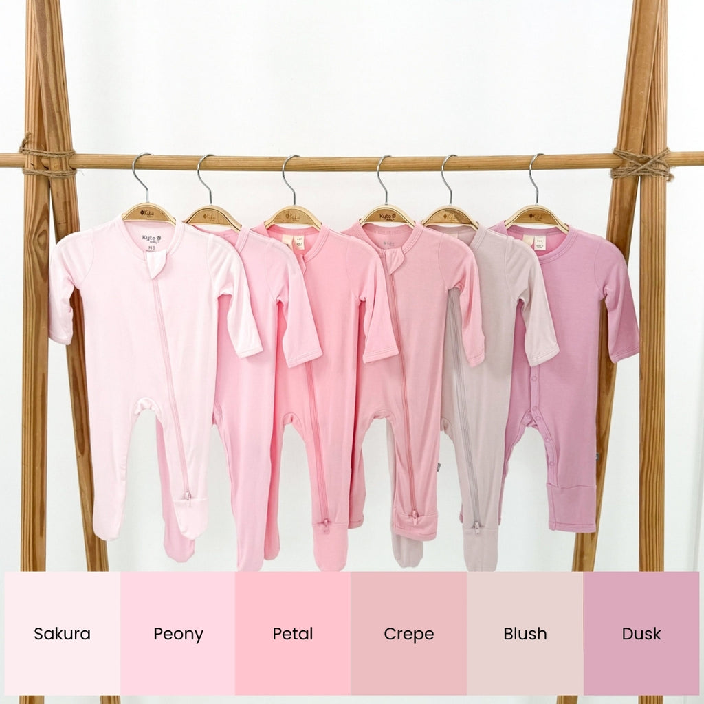
- Compared to Peony, Sakura is similar in hue but is much lighter.
- Sakura is much lighter than Petal, which is a more standard pink.
- Sakura is much lighter and much cooler than Crepe.
- Sakura is much brighter and less grey-toned than Blush.
- Sakura is far lighter and brighter than Dusk.
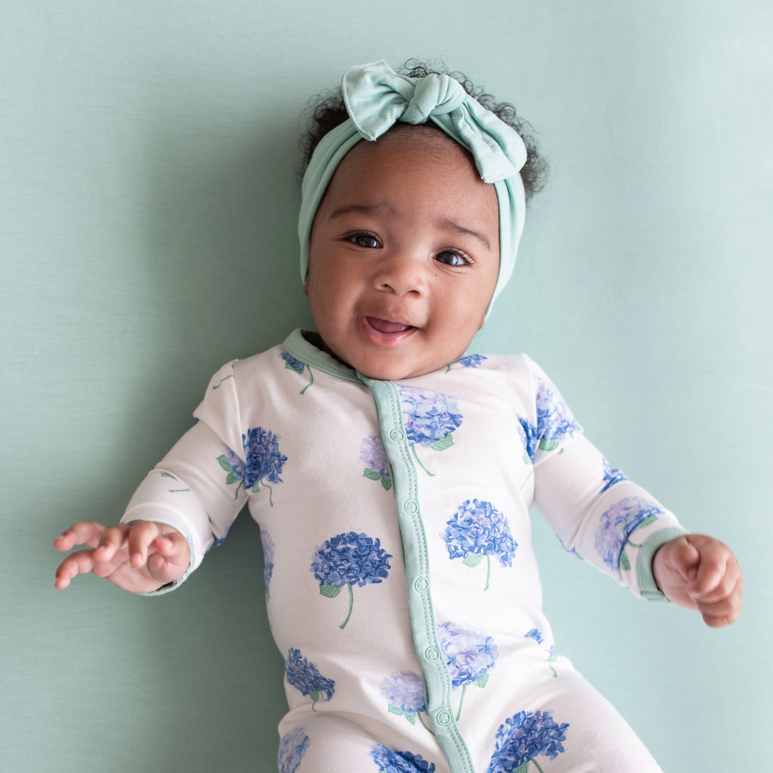
WASABI
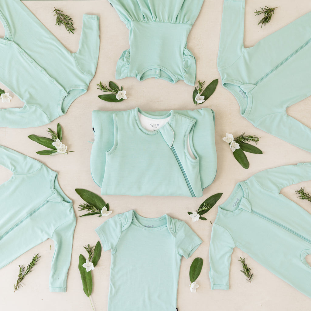
Meet Wasabi, a spearmint green that feels like cool tranquility.
How does Wasabi compare to Sage, Matcha, Pistachio, and Seafoam?
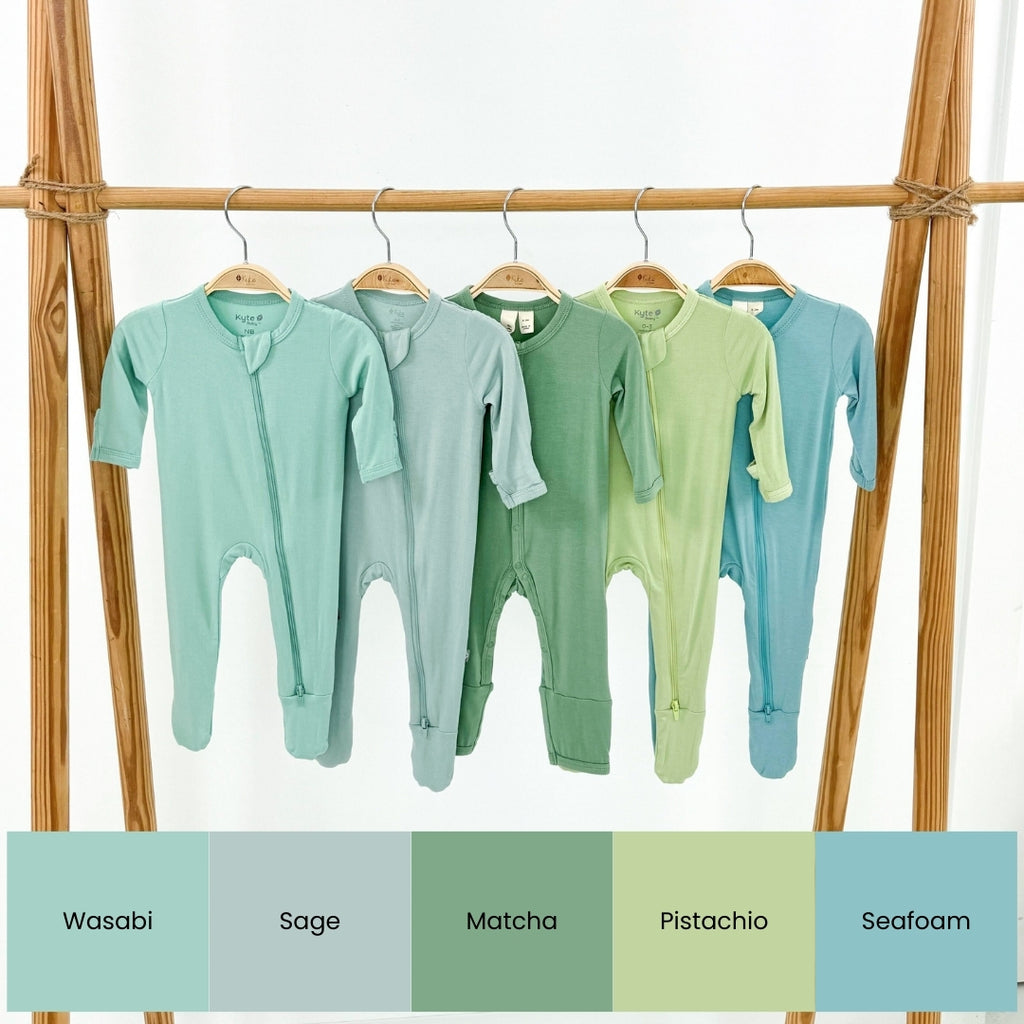
- Wasabi is darker and much more saturated than Sage.
- Wasabi is more vibrant and bluer-hued than Matcha, which is a truer green.
- Wasabi is darker and far less yellow than Pistachio.
- Wasabi has more green than Seafoam, which has more blue hues.
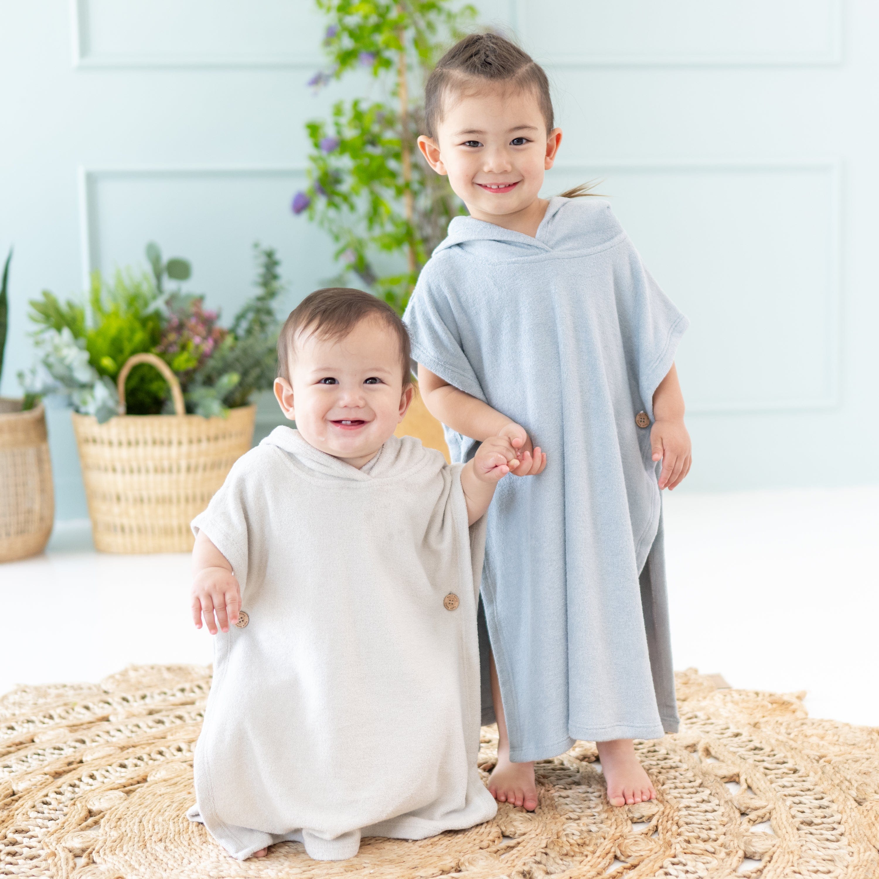
DUSTY BLUE
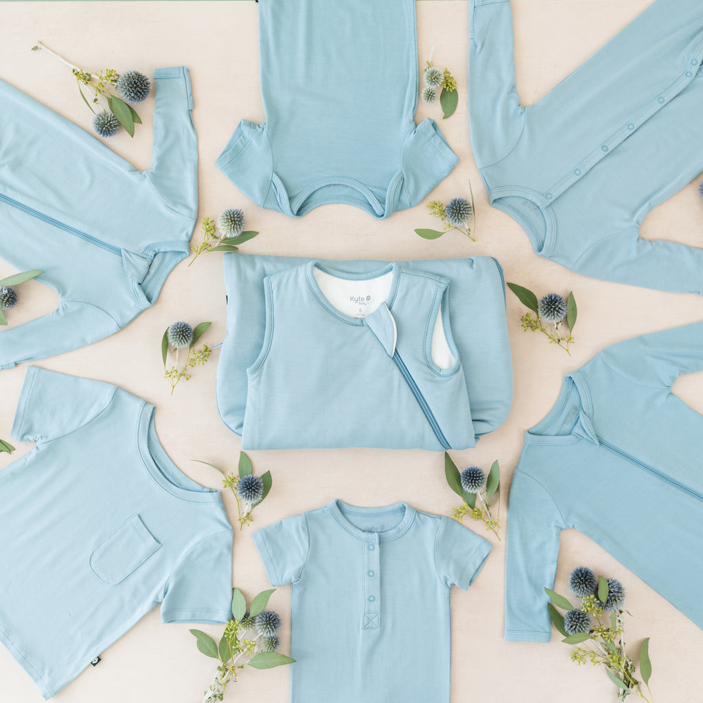
Meet Dusty Blue, a beautiful powder blue that suits every skin tone.
How does Dusty Blue compare to Slate, Stream, Azure, Sky, and Seafoam?
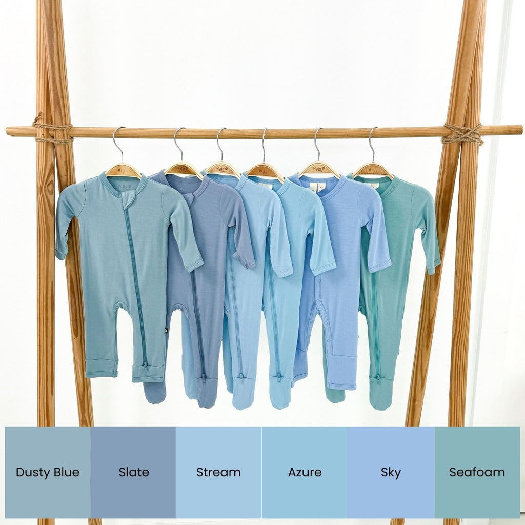
- Dusty Blue is much lighter and warmer than Slate.
- Compared to Stream, Dusty Blue is darker and more grey-toned.
- Dusty Blue is far less bright than Azure, which is a vibrant sky blue.
- Dusty Blue is less saturated than Sky, with far more grey.
- Dusty Blue is far less green and vibrant than Seafoam.
WISTERIA
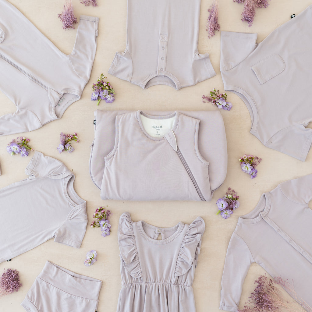
Meet Wisteria, a light dusty mauve that has all the romance of hanging wisteria vines in full bloom.
How does Wisteria compare to Mauve, Taro, Haze, and Orchid?
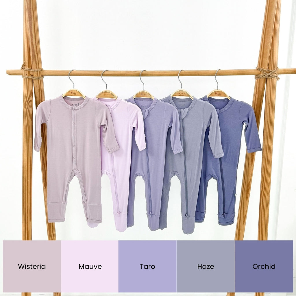
- Compared to Mauve, Wisteria is darker and less saturated, with more grey tones.
- Wisteria is paler and less purple than Taro.
- Wisteria is much lighter and warmer than Haze, which has more blue in it.
- Wisteria is much lighter and warmer than Orchid, with more pink hues than blue.
ECRU
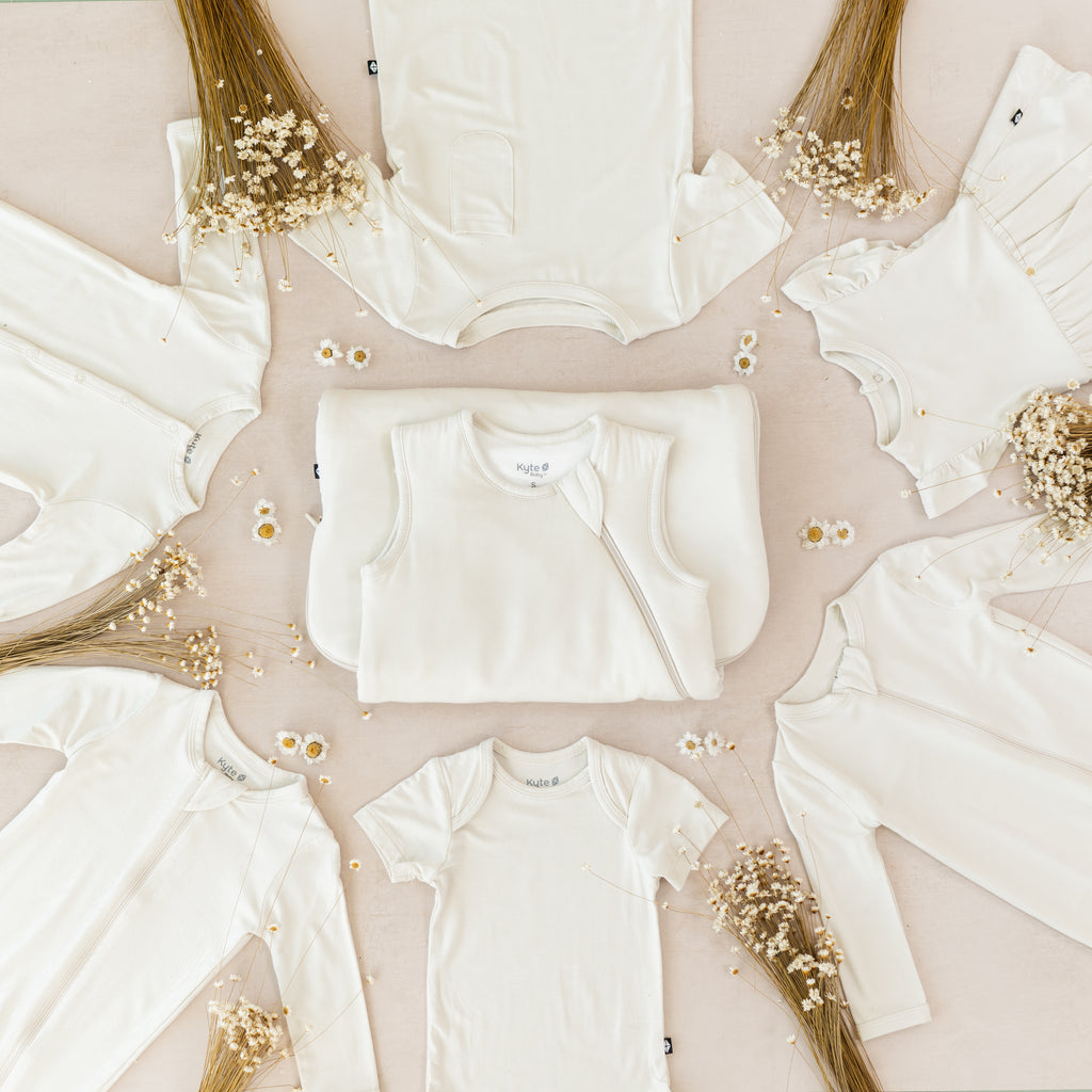
Meet Ecru, a light grayish beige that is the perfect soft neutral.
How does Ecru compare to Oat, Wheat, Khaki, and Cloud?
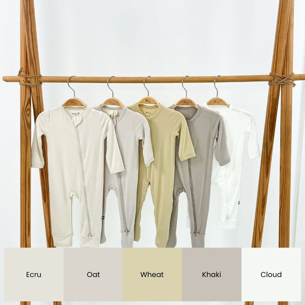
- Ecru is far less gray than Oat and is a true off-white.
- Ecru is far less yellow and more beige than Wheat.
- Ecru is lighter and has more white than Khaki, which is a sandy taupe.
- Ecru is softer and warmer than Cloud, which is a stark white.